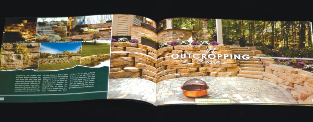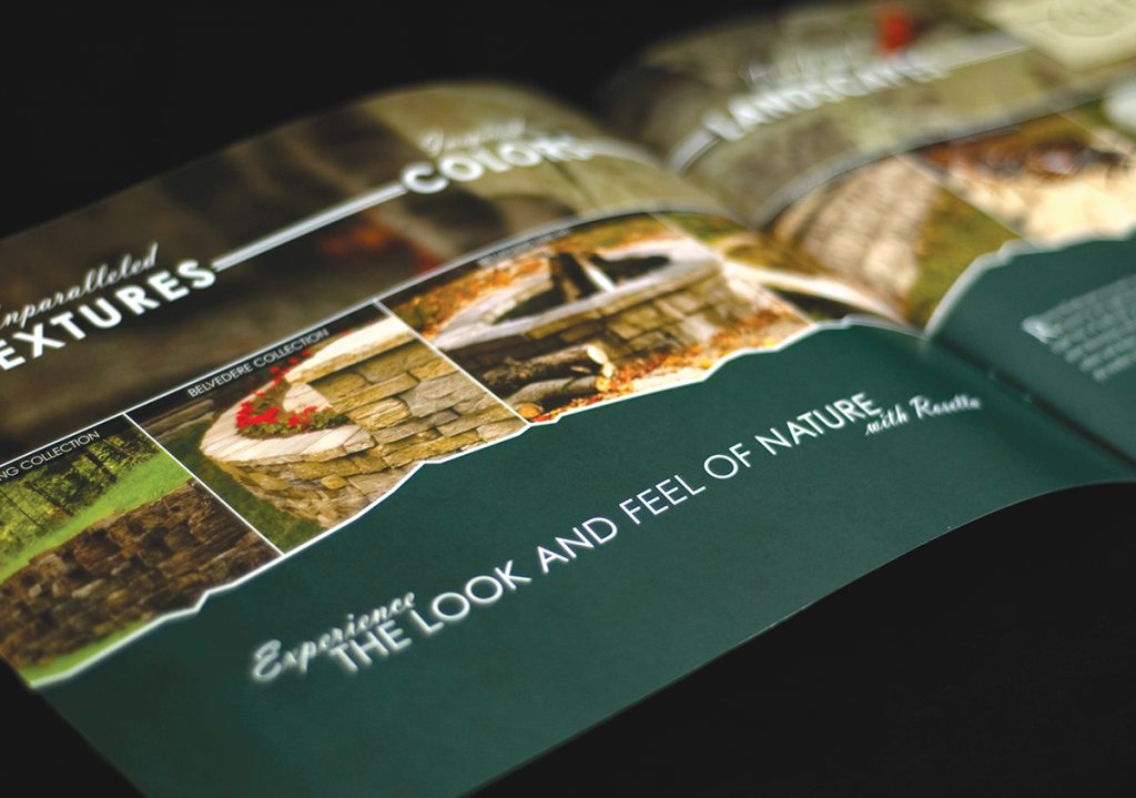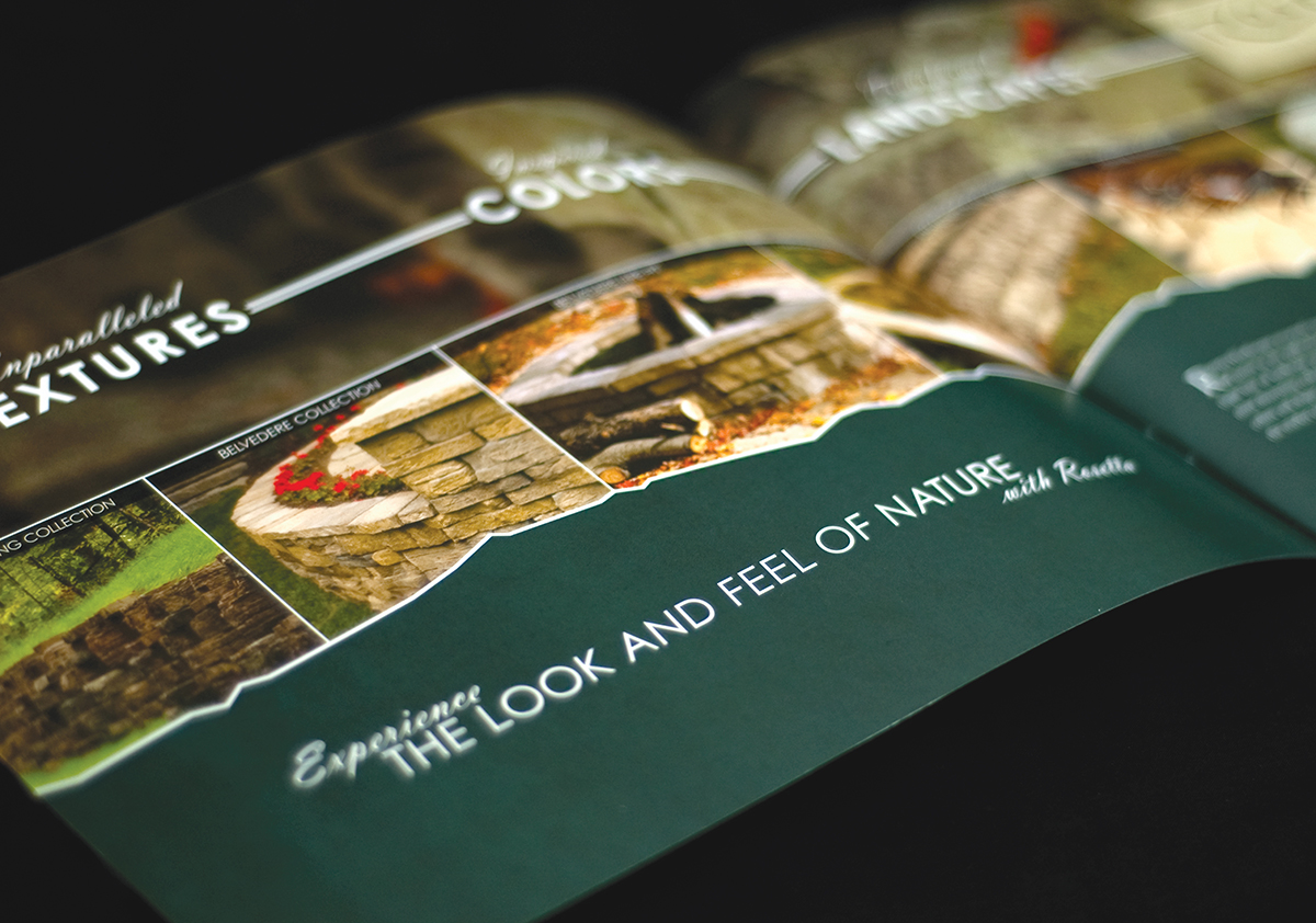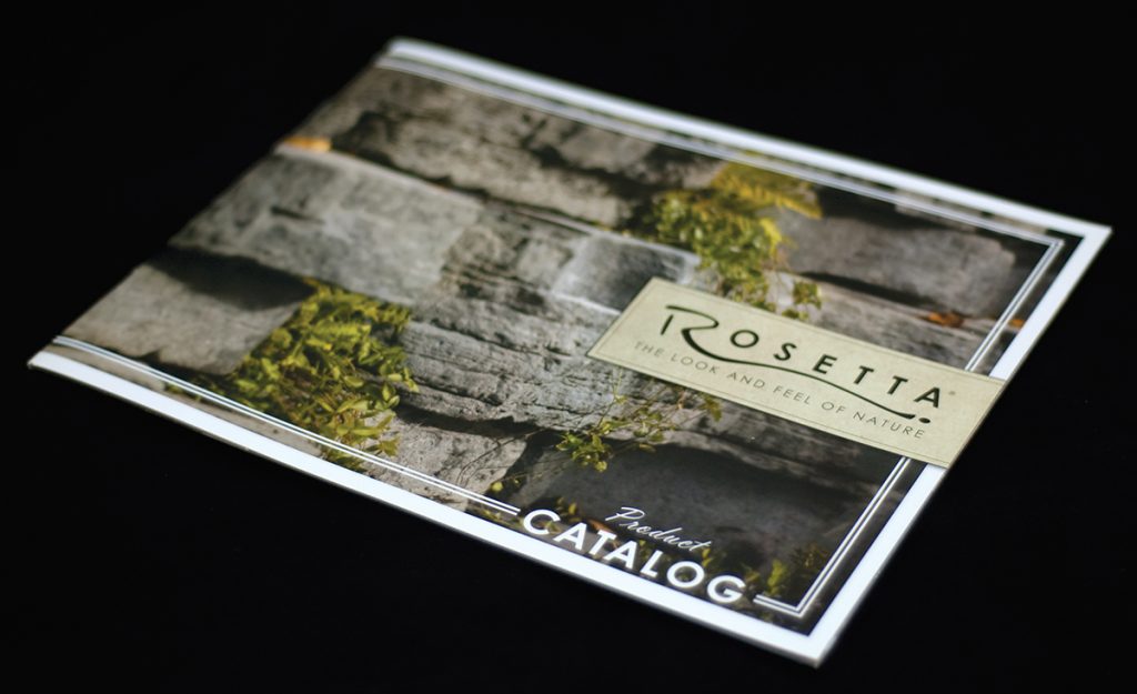
While working for the Manthei collection of companies the managers of Rosetta Hardscapes wanted to refresh their sales material after three years of the previous branding. I was charged with the responsibility of changing the look of the company I had originally helped the brand. After discussing what the goals of the new image should be I was able to research what might best appeal to landscape architects and contractors.
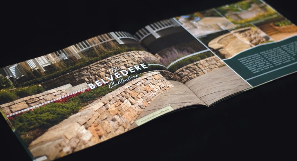
After a good amount of trial and error, I found that combining the previously used sans-serif font with a script-style font created an instant connection with vintage national parks posters. Taking that fortunate outcome and running with it, I brought in subtle textures to the flat colors and took advantage of the mountainous silhouette to push the theme to
